Friday, February 14, 2020

Welcome Moderator


Thomas Hutchinson 1733
Claremont Fan Court School 64680

I worked with Charlie Slorick 1770 and Alexander Wain 1779

Our brief was to make titles and openings of a fictional film. The title to our film is 'Duty Calls'. Our idea was to bring the genre of Film Noir back into the 21st century, by following genre codes and conventions whilst breaking some to bring it to life. The story is about a world leading detective who goes by the name of detective Swanson who discovers one of his best friends has died. It is Swanson’s duty and moral duty to sift through the fog of his job in order to get to the bottom of the crime, by all means necessary. 

Editing: I decided to take the lead in the editing of our film. This was mainly in choosing what stayed and what was cut from the film. In also made the decision to have the flames singled out from the rest of the film to make our film unique. I edited the soundtrack together to add suspense and pace to the film. I also took charge in managing the requests from our director, Alexander Wain as in our group, I was the one most experienced with the editing software we were using.

Camerawork: I stepped back from this role and made sure that the shots we were getting were in focus and that we had a variety of different shots with different angles of the same scenes so when it came to editing we had choice. Charlie Slorick took the lead for this role as we felt he was the most experienced person to take it on. I did contribute and film some scenes and help film some scenes.

Directing: I put forward some initial ideas for our film opening, however, it was Alexander Wain. He wanted to do something related to The Godfather (1972) and we agreed with him and got to work. When it came to filming I did take on role of telling our actors where to be and how to act their part in the scene, however, I did make sure that Alexander was on board with the decisions we were making.

The final production piece can be found here
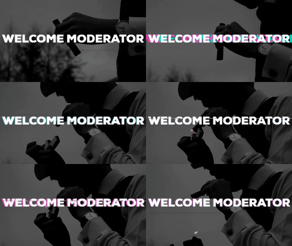
OUR FINAL FILM

We decided to upload our final piece to YouTube on my production team's official youTube channel. Below you will find both screenshots and a link to the finished piece. You can find the final piece here


Construction: BBFC Age Rating


What is the BBFC?

The BBFC (British Board of Film Classification) is a non-governmental organisation, founded by thefilm industry in 1912. It is responsible for the national classifications of films and the censorship of films exhibited at cinemas and other such content. 

What is a BBFC Film Certificate?

A BBFC Film Certificate is a certificate that is given to a film before release which indicates what the minimum age a potential audience member must be in order to view a film in a cinema. It is based on the regularly updated guidelines presented by the BBFC in order to reflect people's current views and expectations. They are used as a guideline for audiences to see what type of film they are about to watch based on the age limit set on the film, with U films being rated as universal, to the opposite end of the spectrum where 18 rated films tend to be gritty. 

What Did We Rate Our Film?

We, as a group, decided to rate our film as BBFC 15. We felt this was most appropriate as there is mild drug use, and strong violence. This take us out of the 12 and 12A category as we felt that the use of cigarettes and cigars was slightly glamourised in our film. We also felt it should be in the 15 category because the violence involved can be depicted as strong, but not as strong as an 18 rated film may be. The content in our film may have been viewed as unacceptable to those younger than 15, so as a result that is the age rating to our film.

How did We Make Our Certificate?

We found a BBFC15 Certificate on the internet and edited in Photoshop. This was a relatively easy task as we all new how to use Photoshop. We had struggle in finding a similar font to the serif font used by the BBFC, so we went with one we found which looked similar. We changed the template's pre-existing content to show: mild drug references and strong violence, to fit with our film.

CONSTRUCTION: Feedback

One of the things we did in order to get a non-biased view of our film production was to screen our film to our peers and get them to give an honest opinion of our film. We had many compliments to our film, such as people enjoyed the professional Idents we had made ourselves, and people enjoyed the monochrome feature to our film as it made the film unique to other things they had seen.


Editing: Changes we made in post were crucial to our film appearing how we wanted it to. One of those things was the seriousness of our film. We didn't want our film to come across as if it was a parody or making fun of the serious issues we were trying to tackle. In order to do this we decided to cut the smiles at the end of some of the scenes that we had not previously noticed. We also trimmed down the pan tilt shot we got of the detective walking away from the camera. We tried to stabilise the hand held shot of the detective walking towards the body, however, we came into problems with this and so we had cut it and choose a different variant of the shot that we had caught on the day, which I think suits the film better. 

CONSTRUCTION: Editing

For our film, we decided to show off our editing expertise and show some of our abilities to use green screens and isolate certain colours in order to bring attention to them. We also voiced over all the dialogue caught on the day in order to make sure that the audio was crystal clear. We decided to take ideas from one of our case studies Roma (2018) We made our film monochrome in order to fit the stereotype of the Film Noir genre we were trying to conform to. I decided to take the lead role in the editing of our film as I was more experienced in editing and I enjoy it. We used Adobe Premiere Pro in order to edit our film to our success.

One of the main things we wanted to accomplish in our film was the continuity of our film to be spotless. We feel as though by carefully looking through the frames of our film to make sure that the flow of the film was not interrupted was key to our film. We also wanted to show our expertise by separating the flame from the lighter and make it stand out in the scene. We did this in Premiere Pro using Lumetri Colour to allow us to select the colour scheme that we wanted to stand out ahead of the monochrome filter. This meant creating another film layer within the edit and highlighting the colour we wanted in that scene. We then removed the other colours that we didn't want in order to have the flame on a clear background to move in sync with the flame in the original. We thought that this effect would help bring a unique aspect to our film and also breaks genre conventions for our genre of Film Noir.

We decided to add a voice over of Big Boss to the end of the film in order to add suspense to the end of the film. This is crucial to the opening of a film as it helps to draw in the audience and makes them wonder what is to happen next in the film. We decided to add a sinister end to the film, suggesting that Detective Swanson is in big trouble and there are bigger criminals in the world that he must fight to take down. We thought by overlaying the logo to our film afterwards would follow the conventions of film openings and would tie up the opening very well. We added some flair to the end title by making the two assets appear separately from each other. I am very happy with the editing of our film.

CONSTRUCTION: Sound

On the day of filming we had a few problems regarding the sound quality of our clips. We managed to fix a few of these issues by adding the DeNoise effect to reduce some of the excess sound, including: wind and other people's voices. We also added a DeReverb to the sound clips to negate some of the echo that came into the clips that we filmed indoors. 

However, one of the major struggles we came into contact with was that some of the sound clips couldn't be salvaged. So as a result we had to voice over some of the clips so what the actor was saying could be heard loud and clear. To overcome this issue, we went to a room which was sound proofed and used a good quality microphone to recapture the voice. We made sure we played the clip that the actor was voicing over was playing in front of them, to assure that the sound was in sync to the video as to make sure it was not out of place.

For the backing track music, ew decided to follow codes and conventions of a Film Noir film. This meant finding the appropriate style of jazz music for our film. We searched the internet for a 1920-50s Jazz style of music and found one by C148 called "Stal". We felt this was appropriate as it has the classical Jazz riffs which were stereotypical of the time. We decided to make sure that the backing track was purely in the back of the film to make sure it didn't over power the voices of the actors in each scene. When it came to the second scene at the marina, I wanted to switch up the pace of the music in order to build suspense to the scene as the detective had entered the lions den of Big Boss. We researched different types of suspense music that could fit in with the time depicted. We feel as though the music we chose fits the scene well.

Monday, February 10, 2020

PLANNING: Risk Assessment

Risk assessment: 

Dark alleyway :
- tripping and injury from lack of balance in the ground

- infection from cutting on glass, needles, knives, etc

Ways to avoid issues: We must be careful when filming in the alleyway, especially if one is holding the camera. This scene requires us as a production team to work together sensibly and carefully. If someone does become injured, there is an adult on set in order to help care towards them.

Boats :
- Water, drowning

- Infection form dirty water

- Falling overboard due to lack of balance of the ground.

Riverbank :

- Falling over the ledge

- Drowning

Again we must be careful when filming on the boat and by the riverside, as we want to make sure we don't lose the camera to the water as well as all our footage.


CONSTRUCTION: Shooting our Film

On the day of shooting our film, we used our Call Sheets to ensure we had all the props and people we needed to have a successful day of filming. We decided to film our short film opening in chronological order to ensure that everyone was involved in the narrative. This meant that the scene in the alleyway where the murder takes place is the first scene to be shot. Charlie was behind the camera, getting many shot variations with different camera angles. 


One of the best shots we were able to achieve that day was the panning shot we got to link a transition to the next scene. I thought that Charlie and Alex did very well in achieving such a smooth shot and left enough time to be able to transition to the marina scene. We also had to film more scenes at the marina and used the tripod to stay as stable on the boat as possible. We managed to obtain many close up shots on Alex B on his cuff links and his cigar that we made. We also achieved a focus pull shot from Alex to the bridge in the distance which I thought looked very professional. We made the decision to film most of Big Boss's shots at a lower angle in order to convey the mood that he was much more powerful than the detective and had a more overpowering sense.


We also decided to use the green screen in our film to show our expertise and skills in order to integrate this. We thought the end product looked very professional and was an overall success and Nathan (Detective Swanson) looked as if he was outside the alleyway in the green screen shot.

Friday, January 24, 2020

CONSTRUCTION: My Ident

IGNITE FLIMS

I named my production company is named IGNITE FILMS. I brain-stormed for logo ideas. I got ideas from a marketing workshop I visited and logos I had made prior to this one. I will show you the steps i went through in order to create the image above (my header) and the Ident which is on my Youtube Channel which is linked last.

I opened up my copy of Photoshop CS6 2018 and created a 1920 x 1080 canvas with a black background. I made the background into a layer and named it Gradient. I chose the Ellipse tool to make a circle, to make is perfect i held Ctrl + Shift in order to make it a perfect circle. i filled it to be white and thus the main circles had been born. The dotted lines were made with the Ellipse tool again, however i changed the line to dotted and made it smaller. I proceeded to add some text in a font i downloaded called Laser84. Laser84 is an 80's style font that is really aesthetically pleasing to me. I added stroke to it and made the stroke 5px large. Next i created a clipping mask to be able to make the circle and the stroke on the font look like a galaxy. To do this, i place the image on the canvas and made it the bigger than the main circle. I right clicked the galaxy image layer and created the clipping mask. I created many versions of the logo using differing images.


I also created my Media Ident. To do this I used two programmes Adobe After Effects CS6 2018 and Adobe Premier Pro CS6 2018.

First of all I downloaded the Saber plugin for AE (After Effects) for the fire effect. I created some flare for the background by using the particle effect, moving it to the bottom right-hand-side of the screen and changed the settings of the particles so they would float and spread them out. Please note that the type of particle was shaded sphere. Then i coloured them a nice fiery orange colour. The reason I chose orange is because it links to the name of my media productions company, IGNITE being the verb to ignite a fire. I then imported a transparent PNG file of the logo into the composition. Please note a transparent image is going to be easier to use when doing this as you wont have to keylight the background.

Next I added the Saber plugin to my logo. The style of effects had a really wide choice, however i found the fire choice and applied it. I changed the layer it would effect to the logo and toned down the brightness of the flames as you could not really see the words in the logo. The actual fire effect was also altered as the fire interfered slightly with the parts of the logo, linking things that should not be linked. After the effects had been changed to my preferences I added the logo again, this was to allow the fire effect to fade out when the logo faded in. I added keyframes from the two second mark to the three second mark to make the fire take time to fully form and slowly disappear. After that had been successfully applied I proceeded to add the effect, Venetian Blinds, to the unaffected logo to make it fade in. I changed the width of the blinds to 10 and changed the direction to 45 degrees. I set it so that from the two second mark to the three second mark it would fade into its full form.

My Ident can be viewed here: MY IDENT

CONSTRUCTION: Film Website

In order to discover what distributing a film in real life would entail, our group made a film website, dedicated to our film Duty Calls. This was a very successful task and we believe our website had a very professional look. Our website includes contact information such as our dedicated film social media and youtube channel. We researched other film websites such as Knives out (2019). We used it as a reference and tried to replicate aspects of the website we liked.

Our film website was made using the WiX website editor, and the link to the website can be found here

PLANNING: Hot Seating

In preparation for the filming of our media production we made a short hot seating video in order to convey how we wanted our characters to present themselves in the actual production. 
We used Adobe Premier Pro CS6 in order to put together the video, and made sure the font was consistent throughout the video. 

We finished the editing process, added names to the scenes of the hot seating and uploaded it to YouTube with tags in order to make our video easily accessible. It can be seen below:

Monday, January 20, 2020

PLANNING: Call Sheets


PLANNING: Initial Mindmap

A key inspiration we found was the notorious gang led by Al Capone(1930's) and his signature dress to impress way of going about things. We immediately saw him as a great example to base the villain of our story as he ruled San Francisco with an Iron Fist which was the approach we wanted to take with our antagonist. As we built on the idea of gangs and Al Capone, we began to draw out the world in which we wanted the plot to inhabit. We then thought of well know gang-related cities, such as New York and Chicago. Although, we still believed that it would be a good idea to directly set the plot in this already existing cities. This would allow us to use existing history around them and create our own history. After that, we began to look at possible characters and started merging the ideas for Film Noir and Al Capone's empire.

We decided to use many stereotypes to convey the Film Noir aesthetic. This is going to mainly be achieved by making the video monochrome as this was conventional at the time as colour video hadn't been invented. the mind map showing our thought process is below.


Wednesday, January 15, 2020

PLANNING: Prop List

After extensive planning, as a group, we began to draw together what props we would need in order to bring our idea to life.


Fedora
This hat is prevalent during the era in which our story takes place. A time in which class is shown in the way in which you dress. We felt that a fedora would be the ideal head wear for the setting the plot takes place in.


Bow Ties
During the 1930s bow ties were common attire for the upper-class members of society and a way of showing sophistication.


False cigar
During the era in which our story takes place, tobacco was a large part of society. There was a divide between the rich, who smoked a cigar, and the lower classes, who smokes cigarettes.


Typewriter
The staple of a stereotypical secretary and appropriate of the time.


False gun
In the wrought times of the big city, people only feel safe with a
pistol in their pocket.

PLANNING: Storyboard


Welcome Moderator

Thomas Hutchinson 1733 Claremont Fan Court School 64680 I worked with Charlie Slorick 1770 and Alexander Wain 1779 Our brief wa...