Monday, October 14, 2019
RESEARCH: ART OF THE TITLE (STRANGER THINGS)
Stranger Things
The colours of the typeface is very stereotypical of the genre set. The red of the font can connote blood, and many of the fans of Stranger things would know this is relevant as one of the characters has nose bleeds in the episodes. The darkness that fills the rest of the screen can connote feelings of evil or unknowing which also fits in with the genre as it is a thriller/horror. This feeling of unknown is what makes a good horror film. The typeface of the title sequence is also associated with the 1980, this ties in with the title sequence as the iconic synth of the 1980's music style is played as non-diegetic sound in the background. The visuals to the title sequence have also been synced to the music that is played, with each time there is strong bass to the music, the frame changes position and new credits are shown on screen. This is very effective as it gives the title sequence pace. The typeface also appears like neon fluorescent lamp which connotes a stereotype of the 80's style of clothing which tended to be bright colours and neon lamps were a regular occurrence.
The story of the title sequence is very linear, with the story being the letters of the title sequence coming together to make the main title. The text tends to slowly move in towards the middle of the screen which is a contrasting white so they stand out in the frame. It makes it very easy for the audience to distinguish who was involved in the making of the TV series.
The weaknesses to the title sequence is that there is no introduction to the prominent actors and actresses involved in the TV series, this means that the audience will struggle to make connections between the characters and the actors that play them. To improve this I would add still shots of the actors with their characters name with the style of the still similar to that of the main header font.
Subscribe to:
Post Comments (Atom)
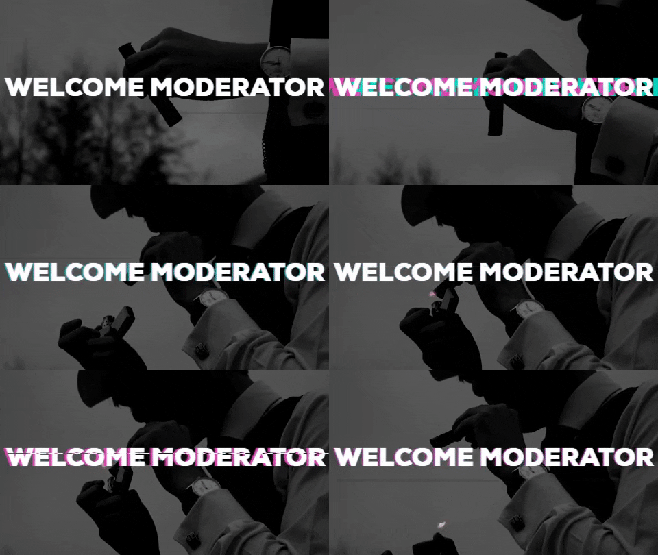
Welcome Moderator
Thomas Hutchinson 1733 Claremont Fan Court School 64680 I worked with Charlie Slorick 1770 and Alexander Wain 1779 Our brief wa...

-
Casting for Duty Calls from TomHutchinson24
-
The title sequence to SPLIT is very effective at showing the genre of the TV series as being psychological horror. This is done by the u...
-
Thomas Hutchinson 1733 Claremont Fan Court School 64680 I worked with Charlie Slorick 1770 and Alexander Wain 1779 Our brief wa...


Thoughtful observations about the lack of protagonists featured in this title sequence, with equally reflective points developed about the typography and how it is all edited together. You also comment on the ways in which genre is signalled just through colour, font and editing.
ReplyDelete